People make all kinds of products and items for use in our day to day lives. However, sometimes the designs of those items is… questionable at best. And sometimes those products can tend to be downright ridiculous. Here are a few examples of those most ridiculously designed products.
Make A Show Of It
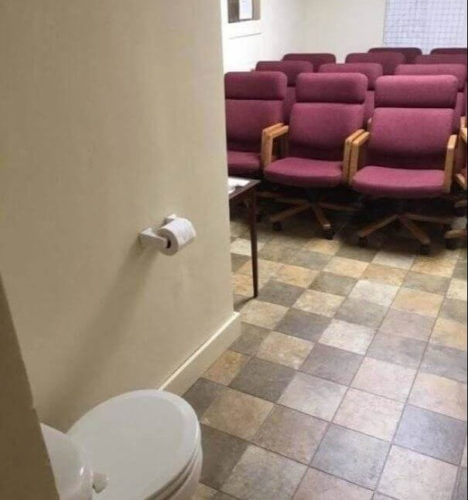
This probably isn’t a theater or anything like that, but there are a lot of chairs in this room. Including one particularly important one. Yeah, why would someone put a toilet in a room with no actual privacy?
What Does That Shirt Say?
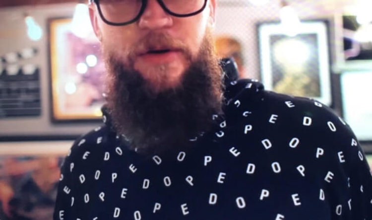
Well, this shirt’s supposed to say “DOPE” on it in weird, spread out letters. But depending on how you look at it, the shirt spells out something completely different. And it’s not at all flattering.
What’s The Message Here?
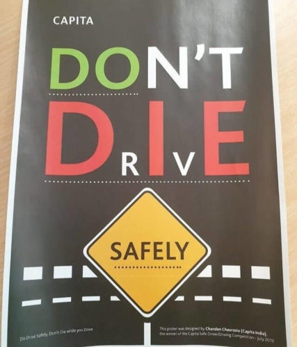
How is this supposed to be read? Cause there’s a lot of different options with how everything’s written out. You can get “Don’t drive safely”, “Do die safely”, or even “Do die safely”. And it’s hard to believe any of those were the intended outcome.
Banana Bag
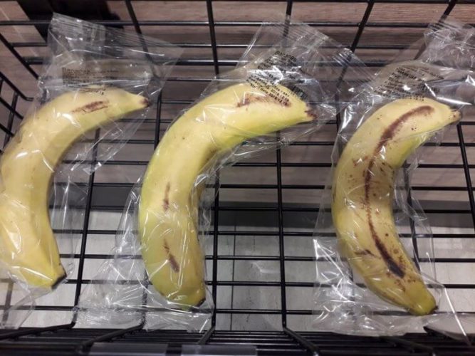
Bananas already have a natural wrapper, why would you feel the need to wrap one up in plastic? Not to mention, the individual wrapping is just wasteful.
Before And After

Something tells me that the before and after photos are not of the same person. As a matter of fact, this really just lowers their credibility. It might actually be an effective workout routine, but we’ll never know.
Nice Bus
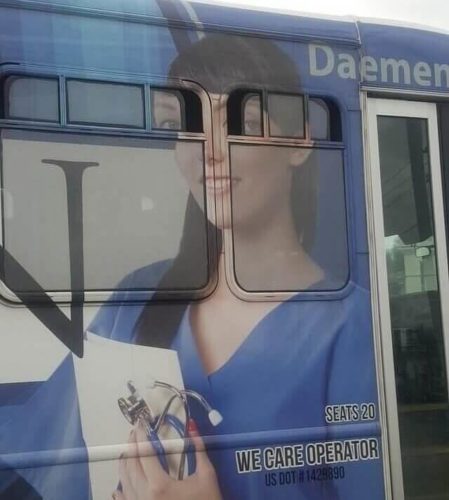
Putting someone’s face on a bus isn’t normally a bad idea. It’s often pretty good advertising. But it’s all a matter of where you put the head. Putting part of the face over a window is just a disaster waiting to happen.
Mind The Light Switch
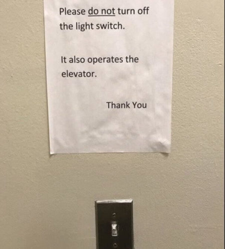
That really is a major design flaw. Especially if this light switch is out in the open. If that sign wasn’t up, the elevator would be out of order almost all the time. And of course there are the people that are just waiting to pull pranks by ignoring the warning.
The Trolley Problem
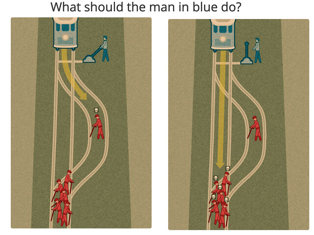
So the Trolley Problem is a philosophical idea based on deciding who would get killed by a trolley. You can either divert the trolley and kill one person you know or do nothing and let it kill five strangers. Well, the way this path’s designed, the five people are going to die regardless, so there’s no point in even humoring the idea of diverting the trolley.
Optical Illusion
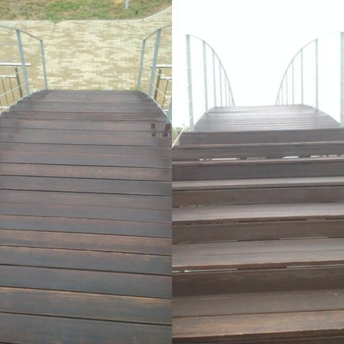
When headed down this bridge, things could get a little dangerous. It looks more like a slope as you start to head down it. The risk of tripping is astronomically high.
The Moat Bench
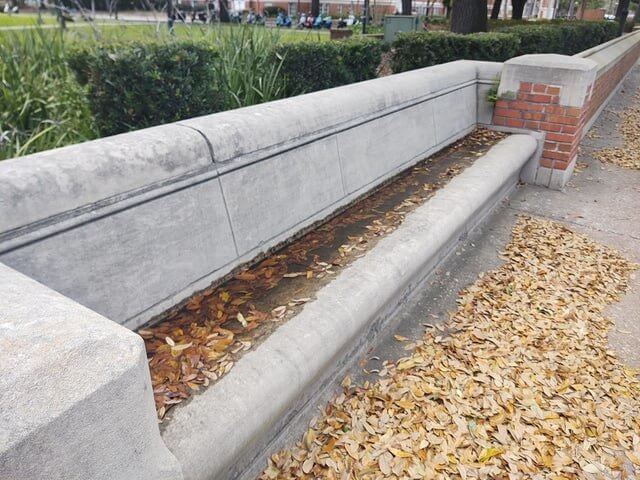
Well, this was designed to be a bench. And it seems as though it transformed into a moat. The divot in the back was just a little bit too deep. After some rain it’s super easy to fill up with water.
A Tiger Ten Years Later
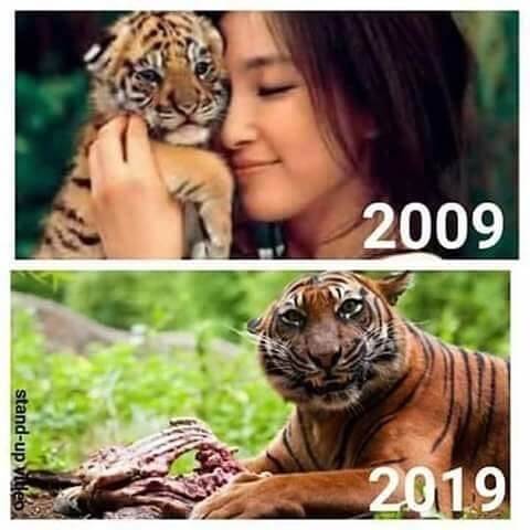
That’s an adorable little tiger cub! This young woman cuddling with it makes it all the more precious! And then ten years later you see it all grown up…! Wait a second… That tiger really does look like it ate that woman.
A Lovely Card
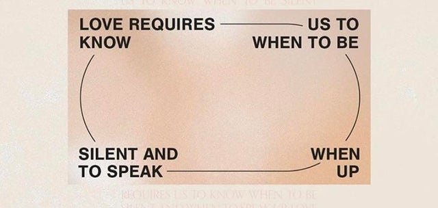
This card is designed rather poorly. You’re supposed to read it from to bottom, line by line, but the way everything’s sectioned off makes you read it by section instead.
Experience!
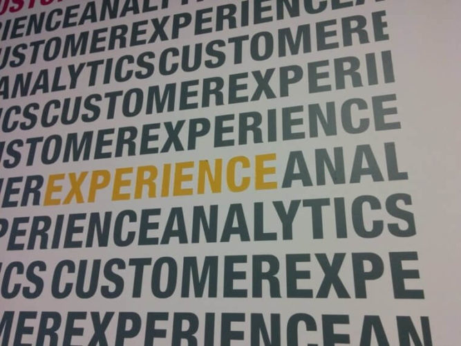
This is supposed to be the words “CUSTOMER” “EXPERIENCE” and “ANALYTICS” over and over again. And the word “EXPERIENCE” is highlighted yellow here to really make it pop. Unfortunately, that also makes the next four letters after it stand out more too.
Marble Keyboard
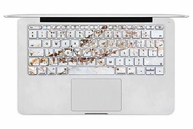
It’s supposed to be designed to look like marble. And in theory, that’s a nice design choice. but the way this looks on the keys makes it look more like a smear or a stain.
The Health Center
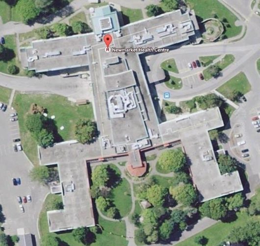
This one isn’t so much a poor design, but it is a ridiculous one. How’d the Newmarket Health Centre end up getting designed like this? If you can’t see it, the building looks like a squatting human.
The Most Dangerous Bike Lane
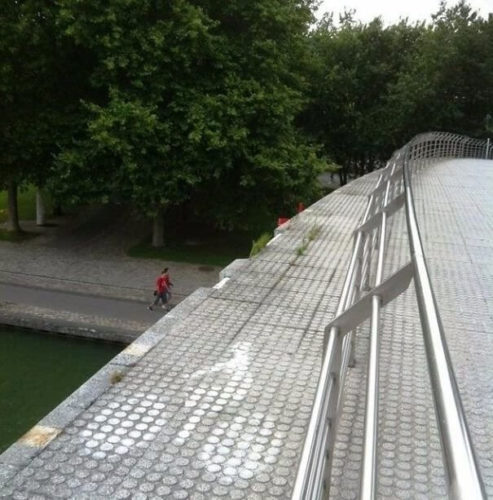
Normally when you hop in a bike lane it’s to stay out of the way of the cars. But the assumption is that the bike lane is safer than not using it. There isn’t even a railing to keep you from falling off of the bridge here.
A Slide For Your Toothbrush
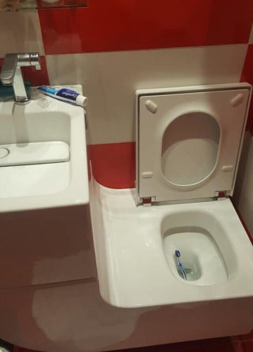
This might not have been a bad design choice, as strange as it looks. Unfortunately, it’s connected to the sink. That means that rather than falling on the floor in the event of a mishap, your toothbrush has a one-way ticket right into your toilet.
Fashion Fart
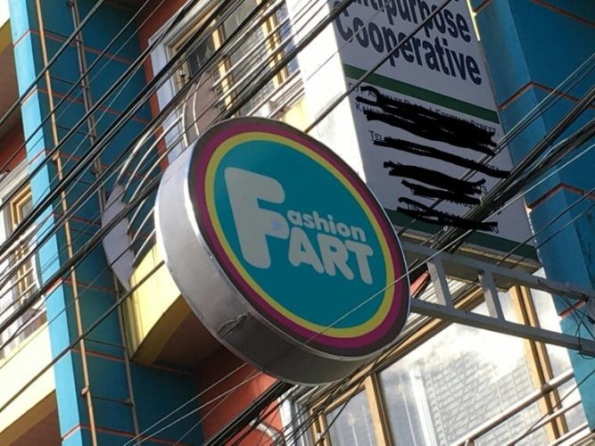
This design speaks for itself. A lot of the time when people use big letters in artwork like this, it’s because the big letter is the first letter in both words. Hence, Fashion Art became Fashion Fart.
Eating Children
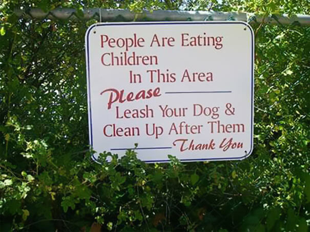
This sign really shows the importance of proper punctuation. And the strange layout of the text in generally really lends credence to the idea that people might actually be eating children.
Zero And O
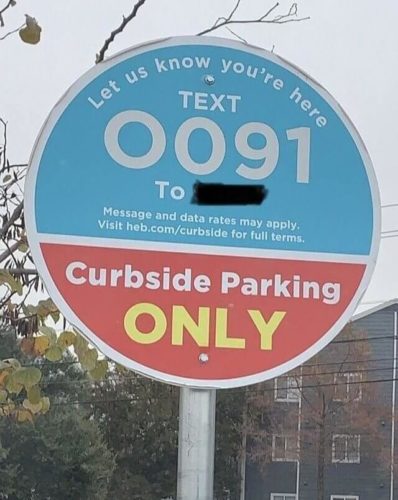
It’s probably really hard to notice at first, but that’s a zero and an “O” in the number you’re supposed to text. A lot of people probably wouldn’t be able to differentiate that and end up texting the number and still not getting what they need.
Make It…
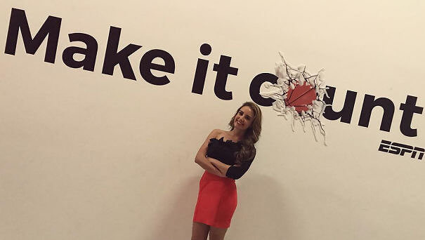
That basketball replacing the “O” really doesn’t give that sign a good look. Now “Make it count” looks like “Make it…” Well, it’s a word most Americans probably wouldn’t want to say in public.
The Sliding Door Company
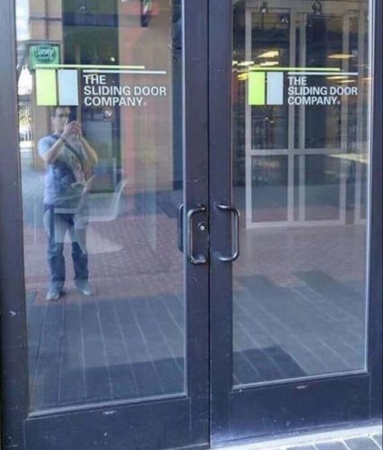
The irony of these doors. One would expect the Sliding Door Company to use sliding doors to enter their building. That’s probably why the man reflected in the window decided to snap a pic in the first place.
The Thin Window
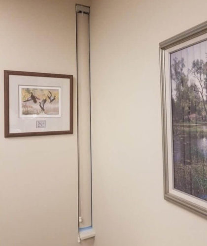
Yes, that’s a window. An incredibly thin window with an incredibly thin blind. It really just makes someone stop and ask “what’s the point?”
The M&M’s Mascots
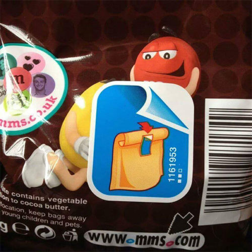
Someone really wasn’t thinking when they put the sticker here on this M&M’s package. Everyone knows Red and Yellow are friends, but people didn’t think their relationship was like that.
Pokey Mug
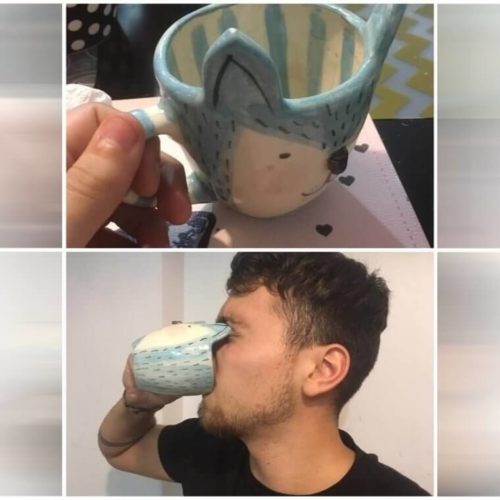
It’s not just this mug that’s a problem, but all mugs with an ear design in general. It seems like a nice idea at first. But then you have to drink from it. Even if the ears don’t just poke you in the eyes, they’ll at least get you in the chin, or somewhere on your face.
Sponsored Content

